Summary
In 2011 a dramatic shift occurred throughout the developed world — working age populations began a multi-decade decline. Demographic shifts like this in an economy can have profound effects, including changes in growth and debt metrics. To understand these effects we will start by explaining the economic effects in simple terms, seek insights from Japan, which was the first economy to undergo the demographic shift, and determine the impact on the world’s ten largest developed economies.
Back when it all began
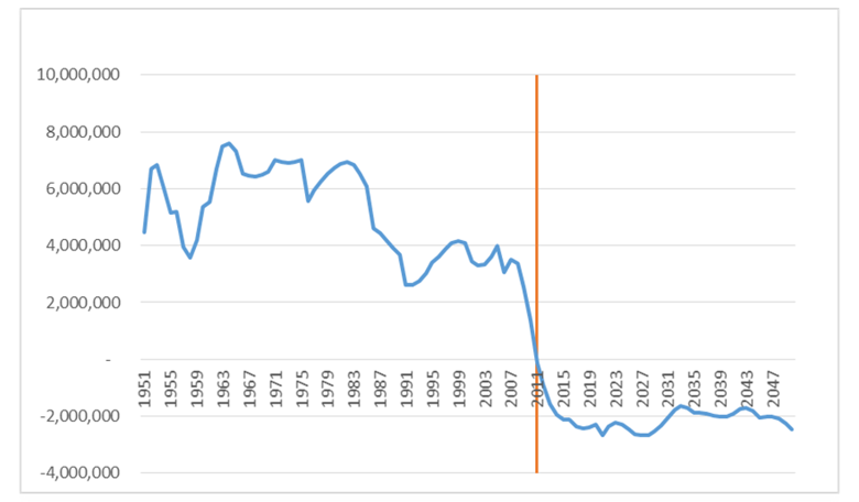
From a demographic perspective, the developed world changed in 2011 when a population tailwind turned into a headwind. The yearly change in working age population (those aged 15 – 64) across the developed world went from a clear positive to a consistent negative.
Between 1950 and 2008 the developed world was adding approximately 2 – 6 million working age people per year to the economy, allowing workforces to expand globally. However, since 2011 the number of working age people in the developed world has been declining by approximately 2.5 million each year, with the expectation that this will continue over the decades to come.
Chart 1: Change in working age population – developed world
Source: United Nations DESA Population Division
A simple model for measuring growth
A straightforward way to demonstrate the effect of demographics on growth is to use a simple GDP model.
Since GDP is the total goods and services produced by every person in an economy, our model states that in order to grow, an economy can increase the number of people working and/or improve how efficiently those people work. When the working age population declines, both workplace growth and productivity growth have the potential to fall — contributing to lower potential GDP growth.
1. Workforce growth – putting the numbers to work
The first element of our GDP model states that an economy can grow by having more people working, as greater output is achieved by more people. When an economy sees its working age population increase, it has a greater ability to recruit new employees into its workforce, pushing potential GDP higher. The converse of this relationship should, therefore, hold true: as the working age population declines, there are fewer people available to produce goods and so GDP is lower.
Let us take a look at simplified example: Assume we have an economy with 100 employed people who can produce 10 goods in the economy per year. If one additional employee enters the workforce over the next two years, the economy could achieve 1% growth without doing much else.
Table 1
| Increasing workforce | Year 1 | Year 2 | Year 3 |
|---|---|---|---|
| Number of people working | 100 | 101 | 102 |
| Yearly production per person | 10 | 10 | 10 |
| Total goods created | 1,000 | 1,010 | 1,020 |
| YoY growth | 1.0% | 1.0% |
If we assume instead of one person entering the workforce that one person retires, then the opposite of the above holds true. Suddenly the potential output of the economy declines as there are fewer people available to work. In order to achieve just zero economic growth the remaining workers need to increase their yearly production by either working smarter or harder.
Table 2
| Decreasing workforce | Year 1 | Year 2 | Year 3 |
|---|---|---|---|
| Number of people working | 100 | 99 | 98 |
| Yearly production per person | 10 | 10 | 10 |
| Total goods created | 1,000 | 990 | 980 |
| YoY growth | -1.0% | -1.0% |
This simple example shows why the demographic transition of 2011 is such an important change in economic fundamentals. The tailwind of 2 – 6 million potential workers entering the workforce every year has switched to a headwind of 2.5 million workers potentially leaving the workforce. So governments will need to incentivise employees to remain in the workforce or face declining employment bases and levels of growth.
Looking to the East – a lesson from Japan
This simple example may be well and good in theory, but what about a real-world example?
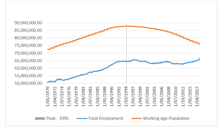
If we look to Japan, we can see that total employment began to stagnate in the mid ’90s — right around the time that the working age population peaked. Unsurprisingly, this coincided with the beginning of the two last decades when growth in the economy came predominantly from productivity, i.e. people doing things more efficiently, rather than having more workers producing goods.
Chart 2: Working age population and employment - Japan
Source: United Nations DESA Population Division, Bloomberg
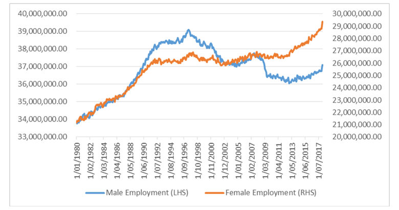
Despite a continued decrease in the working age population, total employment began increasing in 2012. This timing coincided with the introduction of ‘Abenomics’ — a three-pronged policy approach implemented by the Japanese government. Part of this policy included structural reform designed to encourage women to enter the workforce to address the traditionally low employment rate of Japanese women. This policy allowed the Japanese workforce to grow by tapping an underutilised part of the economy, bringing signs of life back into the workforce.
This response highlights the importance for governments to find structural reforms and incentives that encourage workers to enter or remain in the labour market to offset the effects of a declining working age population. While an increase such as this cannot continue in perpetuity, as the working age population will continue to decline, it can help soften the blow of demographic changes and improve growth over the short to medium term.
Chart 3: Employment by gender – Japan
Source: Bloomberg
It is interesting to observe is how closely aligned the Japanese example is to our earlier hypothetical example. Since the working age population started declining it has become harder for Japan to increase the number of people available to produce goods in their economy. Overall this has caused the potential GDP growth of the economy to slow and now requires good planning and structural reform from the government to increase its workforce, rather than just relying on a natural increase over time.
2. Productivity growth – the effect of age
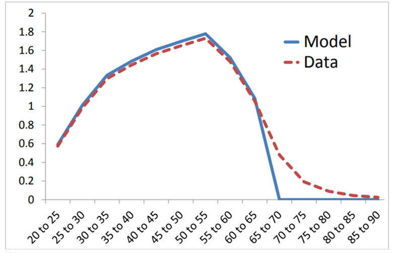
The second element of the simple growth model is how efficiently the workforce produces goods and service. Demographics can also have a considerable influence on productivity as people acquire new skills at a different pace throughout their lives. Recent research from the Bank of England states that “the productivity of young and old workers is lower” than those middle–aged, with productivity reaching “its peak around age 50”1. This means that an economy with a large percentage of people rising from age 20 to 50 will likely see higher productivity growth than one with a large cohort of people aged over 50.
The following chart, which shows average productivity of a worker by age, captures this idea. For people aged 20 – 50, productivity increases rapidly as they acquire new skills in the workforce. Once a person reaches 60+, however, their productivity begins to decline and ultimately falls to zero as they retire.
Chart 4: Labour productivity by age
Source: Bank of England
As an economy matures, it will, on average, see higher percentages of the workforce in the lower productivity growth buckets, weighing against overall productivity levels. Researchers at the International Monetary Fund found similar results when studying Japan, stating “that aging of the working age population has had a significant negative impact on total factor productivity.”2
From a demographic perspective we can see that a decreasing working age population can have implications for both how many people are working and how quickly those workers acquire new skills. This means that both elements of our growth equation (workforce growth and productivity growth) are likely to slow, leading to slower long-term potential GDP.
Funding the challenge: the impact of an ageing population on government debt
Like growth, demographics can have profound implications for government debt depending on how policy makers tackle its effects. There are two key mechanisms at play. Firstly, as a greater percentage of the population enters retirement it requires greater welfare spending from the government. Secondly, as the working age population declines it means that the number of people available to be taxed to fund those benefits decreases.
Once again, we can use a simple example of an economy with 100 people to demonstrate this concept. Assume that at year one, five people in this economy are retired and the remaining 95 work and pay taxes to fund the retirees’ pensions. If each retiree received $1,000, the total funding required would be $5,000, or $52 per working person ($5,000 / 95). If one person retires each year over the next 10 years, then by year 10 we would have 86 workers and 14 retirees. At $1,000 per retiree this would require $14,000 of pension funding spread across only 86 people, or $162 per working person ($14,000 / 86).
This simple example shows how governments can be exposed to stresses on both revenues and expenditures as their working age population declines.
While this is a hypothetical example, which misses many nuances of the real world, it largely defines the challenges that aging economies create for policy makers. Given governments are reluctant to cut pensions and raise taxes for political reasons, the natural release valve is for the government to increase government debt to cover its shortfalls. This is what has been observed in Japan over the past 20 years.
On the rise - the Japanese debt experience
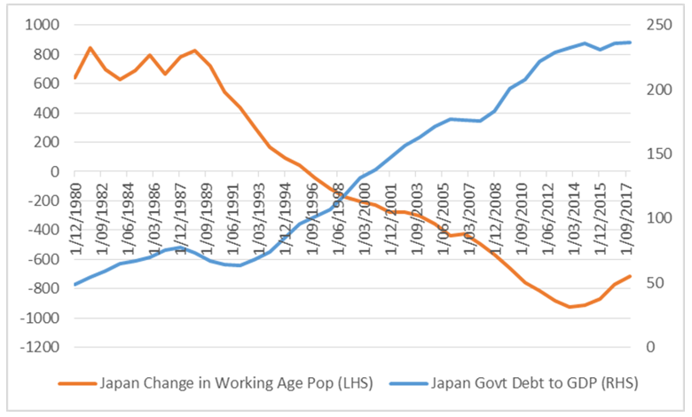
Over the past 20 years the Japanese government has experienced an unprecedented run up in government debt to GDP, increasing from approximately 65% in the early ’90s to over 230% today. During this period the government struggled to increase tax revenues as expenditures increased. The timing of this increase coincides with the start of the decline in the working age population.
Chart 5: Labour productivity by age
Source: United Nations DESA Population Division, Bloomberg
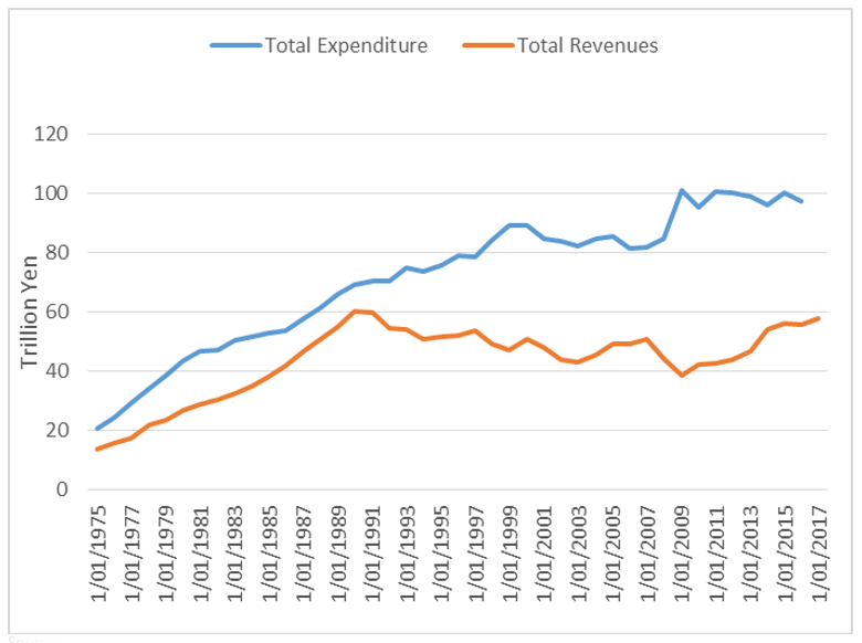
Let us explore this point further by breaking down the Japanese budget position into revenues and expenditures. Chart 6 shows that the Japanese government’s tax revenue peaked in 1989, just before the working age population began its decline and total employment peaked. Expenditures on the other hand continued higher, eclipsing the spending seen in 1989.
Chart 6: Tax revenue and total expenditure - Japan
Source: Japanese Ministry of Finance
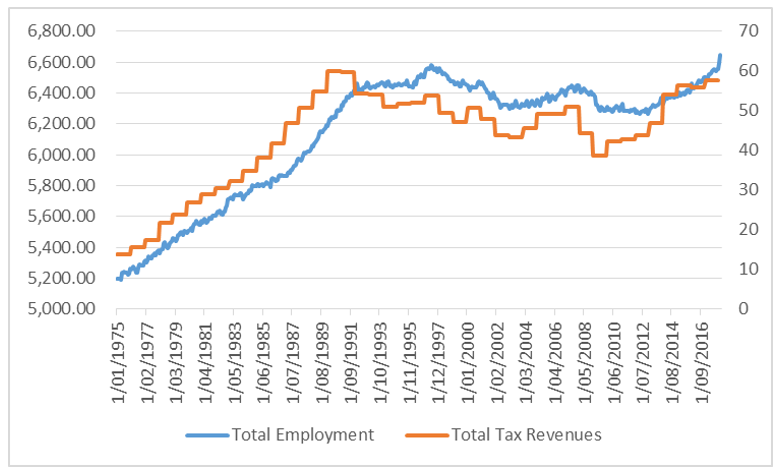
Tax revenues show the importance of increasing employment in an economy, as higher employment means a government can achieve greater tax revenues. In line with employment, Japan’s total tax revenues peaked around 1989 and struggled to recover until the workforce growth improved in 2012. This directly shows the effect that a declining working age population can have on government finances, as it implies that there is going to be a smaller pool of employees to absorb the tax burden.
Chart 7: Employment and tax revenues - Japan
Source: Japanese Ministry of Finance, Bloomberg
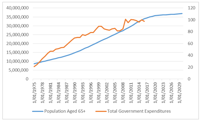
Over the past two decades government expenditures have continued to increase. This was partly driven by social security increases from 47.4 trillion yen in 1990 to 112.1 trillion yen in 2014, which currently represents approximately 33% of government expenditures. While part of the Japanese social security system is funded by contributions, the shortfall must be made up from government revenues or debt.
Chart 8: Elderly population and government expenditures - Japan
Source: Japanese Ministry of Finance, United Nations DESA Population Division
The culmination of rising social security costs and a flat tax base means the government has had to borrow large amounts of money to maintain the status quo. Given the demographic outlook for Japan, this is set to continue into the future.
In the 2017 Japanese Public Finance Sheet3 the government said it “projected that the size of the social security costs will increase rapidly because of the aging population” and that “in particular, the benefits of medical and long-term care will face higher growth than the projected GDP growth”.
The simple example described above, of small tax bases funding a greater number of retirees, reflects the results seen in an aging economy and should raise some concern for governments in other developed countries that are starting to see a decline in their working age populations.
Not all countries are the same
As described throughout this article, negative working age population growth can have profound implications for economic growth, causing a structural tailwind to turn into a headwind. However demographics are often used as a catch-all term, lumping the entire developed world into the same basket. While on aggregate this is true — the developed region as a whole is growing older — it neglects some of the nuance that can be found within population structures.
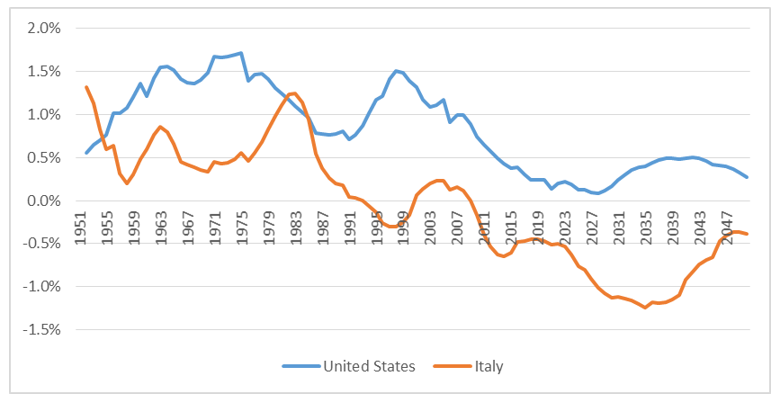
A simple example of this can be seen by examining the difference between the working age population of Italy and the United States. In the United States working age population growth has approached zero, but manages to remain positive and is expected to do so going forward. Italy, however, has started to see its working age population decline, a process which will accelerate into the 2020s.
Chart 9: Percentage change in working age populations – US and Italy
Source: United Nations DESA Population Division
This means that while the developed world has changed since 2011, the pace of that change will vary from country to country. The countries with the fastest declines in working age population are those most susceptible to the effects outlined above, while those with positive working age population growth will be in a better position to manage the effects.
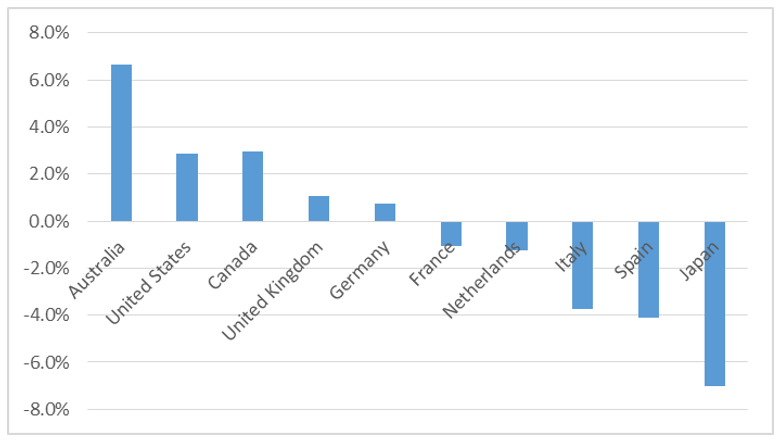
To show country differences we have ranked the ten largest developed countries by working age population growth over the past seven years. These ten countries can be split into three broad groups: the good (Australia, United States and Canada,), the average (United Kingdom, Germany, France and Netherlands) and the bad (Italy, Spain and Japan).
Chart 10: Growth in working age population - 2011 to 2018
Source: United Nations DESA Population Division
A numbers game – searching for evidence
Given the effects of demographic changes on economic variables and the wide differences in working age population growth over the past seven years, there should be clear differences in economic performance. Our findings show that these ten countries do indeed follow a distribution based on their working age population growth, with better performance seen in countries with positive working age population growth compared to those with a declining working age population.
A focus on growth
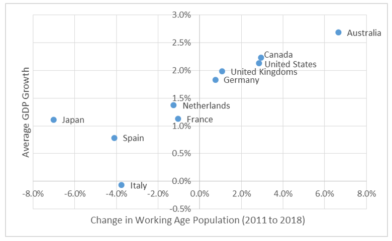
In terms of GDP growth, Chart 11, which shows average levels of GDP growth since 2011 against the total change in working age population, reveals that countries in the top right corner (Australia, Canada and United States) have seen strong working age population growth and subsequently relatively strong GDP growth. The countries in the bottom left corner (Japan, Spain and Italy) have seen their working age populations decline and subsequently achieved low levels of economic growth. This distribution highlights the importance of working age populations on economic growth, as countries with growing population bases have shown an ability to outperform their peers.
Chart 11: Working age population growth and GDP
Source: Bloomberg, United Nations DESA Population Division
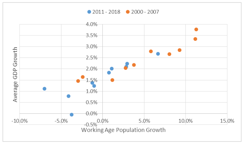
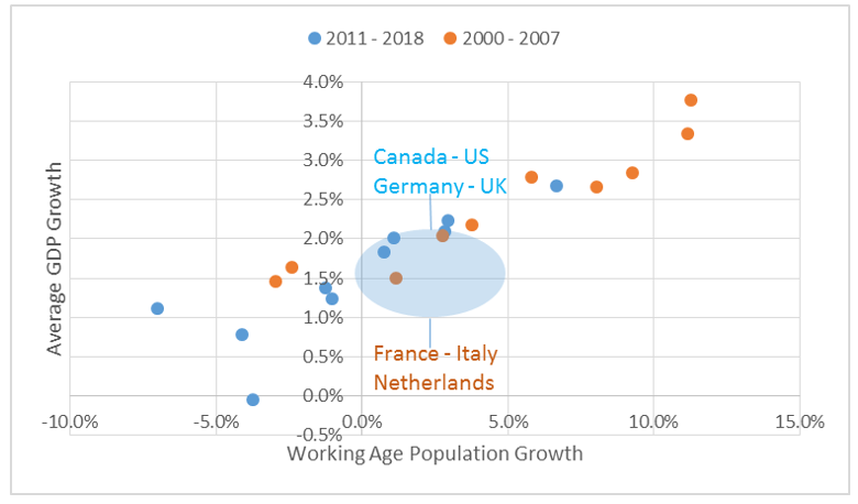
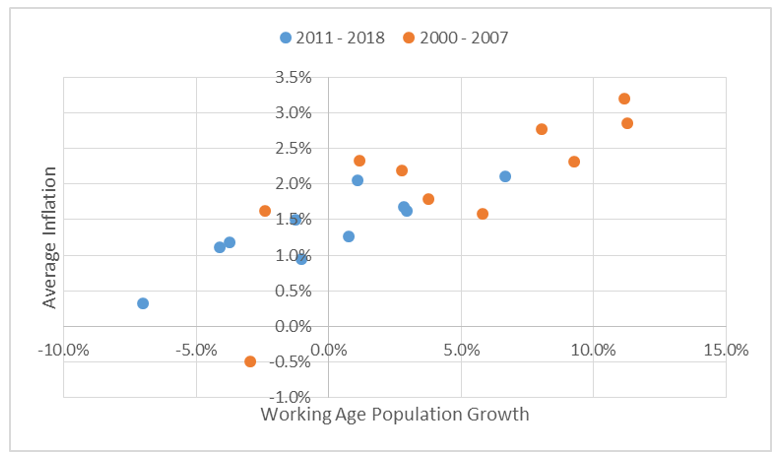
This analysis can be taken one step further by adding the observed outcomes from 2000 – 2007 for the same countries, a period when working age population growth was positive. In the charts below the blue dots represent the outcomes from 2011 to 2018, while the orange dots represent the outcomes from 2000 to 2007.
When adding in the observations from the prior decade for GDP growth, the distribution retains its tight upwards sloping shape. That is the higher the working age population growth the greater level of GDP growth achieved, regardless of the decade it occurred. This should not be surprising given that GDP is a function of the number of people available to work in an economy. Over the past seven years the working age population growth in the developed world has shifted lower, dragging down growth rates from an average of 2.4% to 1.5%.
Chart 12: Working age population and growth
Source: Bloomberg, United Nations DESA Population Division
Two observations stand out here. Firstly those countries that achieved 0 – 5% total growth in working age population, whether in the 2000s or in the 2010s, have seen average GDP growth rates of around 2% p.a. This has occurred across decades and within different countries, as the later set includes Canada, Germany, US and UK while the former set includes France, Italy and Netherlands. In addition, the countries to the right of this box all achieved stronger average economic growth, while those to the left of the box all averaged below 2% growth.
Chart 13: Working age population and growth
Source: Bloomberg, United Nations DESA Population Division
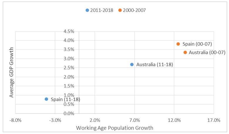
The second observation is the parallel between Australia and Spain could not be greater. From 2000 to 2007 both countries boasted large increases in their working age populations with rates of growth above 3%. However, since 2011 the fortunes of each country have shifted dramatically — the Spanish working age population has declined by 4% while Australia’s expanded by over 6%. This has seen Australian GDP average 2.5% over this period, remaining one of the fastest growing developed economies in the world. Spain, however, suffered a fall from grace achieving less than 1% growth on average over the past seven years.
Chart 14: Working age population and growth – Australia and Spain
Source: Bloomberg, United Nations DESA Population Division
The rise and rise of population and inflation
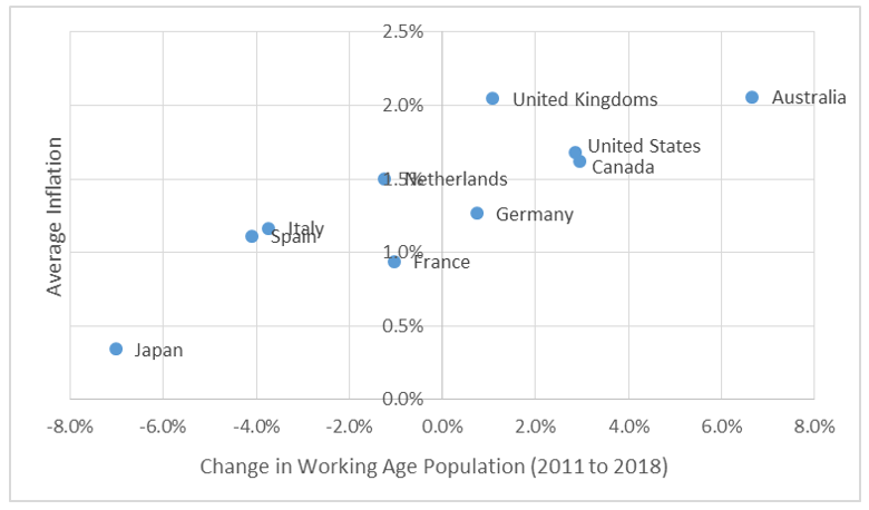
Similar to growth, the effects of the change in working age population can also be seen on inflation. The average inflation rate of those with rising working age populations has typically been more positive than those with negative working age populations. While the results in this scatter plot are a little more varied, it depicts that on average the countries with good working age population growth will outperform those that are seeing declines.
Chart 15: Working age population growth and inflation
Source: Bloomberg, United Nations DESA Population Division
While not quite as strong as the growth relationship, the same pattern holds when examining rates of inflation through time. The stronger working age population growth of the early 2000s brought with it higher inflation, particularly in those countries with the largest increase in working age population. The countries with negative working age population growth, whether in the 2000s or 2010s, have seen sub 2% inflation and in some cases deflation. Just like economic growth, the entire distribution has shifted down and to the left, as lower working age population growth has, on average, meant lower levels of inflation across the developed world.
Chart 16: Working age population and inflation
Source: Bloomberg, United Nations DESA Population Division
Over the past five years policy makers have frequently questioned what has caused inflation and growth to be lower than expected despite extremely aggressive monetary policy. This breakdown of economic statistics against working age populations raises the prospect that a very simple answer is the problem: working age populations have started declining.
Demographics attract a lot of interest
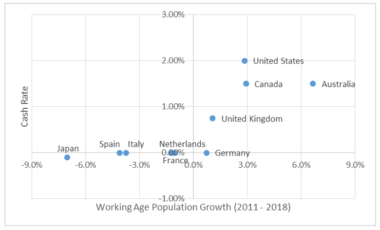
Given the links between the working age population growth and economic performance, it should come as no surprise that demographic factors also have a strong relationship with interest rates. This is most obviously seen in countries that exhibit negative working age population growth, as those central banks (Bank of Japan and European Central Bank) have been the most aggressive in easing monetary policy. Conversely the countries with positive working age population growth have been able to achieve higher levels of growth and inflation, bringing with it a higher interest rate structure.
Chart 17: Working age population and cash rate
Source: Bloomberg, United Nations DESA Population Division
In light of the demographic effects on growth and inflation, it seems that the countries with negative working age population growth are fighting against father time. In these countries interest rates have been moved to negative levels in order to encourage growth, which will offset the drag of having fewer people available for work. Whether or not this is a correct response to declining working age populations remains to be seen and requires a larger discussion to describe its effects.
The outlook for the next seven years
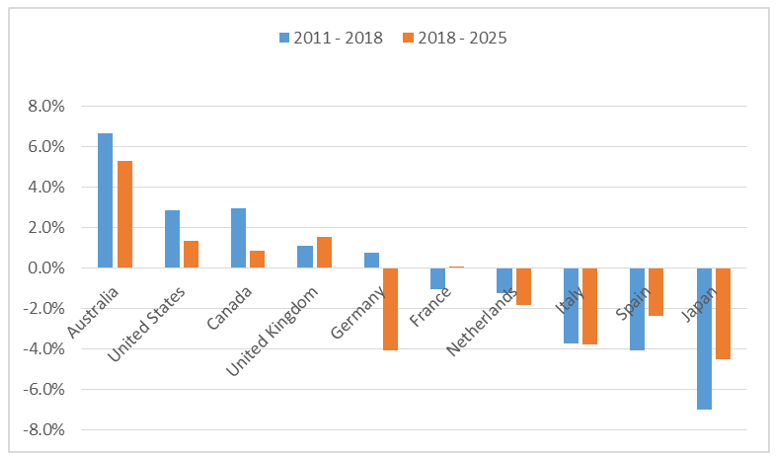
From a demographic perspective the next seven years are going to produce similar economic challenges to the past seven, with only the United Kingdom expected to see a higher rate of working age population growth compared to the period 2011 – 2018. By and large the country set retains its ordering with Japan and European countries exhibiting negative working age population growth, and Australia, US, Canada and UK showing positive growth. However, only Australia is expected to see even modest growth (at approximately 5%), while the United States, Canada and UK fall somewhere between 0 – 2%.
Chart 18: Growth in working age population
Source: Bloomberg, United Nations DESA Population Division
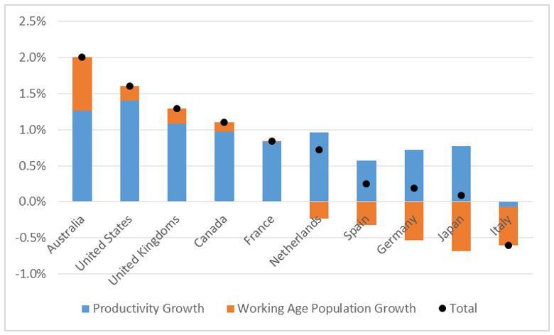
If we return to our original assumption that GDP = Workforce Growth + Productivity Growth, then we can provide some insight into the potential economic growth rates in these countries over the next seven years. In order to do this we will take the average working age population growth from 2018 to 2025 and add an estimate for productivity growth.
For simplicity’s sake we assume that potential productivity growth over the next seven years will equal the average productivity growth that has been achieved over the past two decades. This produces the following expected potential growth rates:
Chart 19: Estimated potential growth rate
Source: Bloomberg, United Nations DESA Population Division
The same four countries remain in the strongest position for growth (Australia, US, UK, Canada), while Europe continues to face structural headwinds against growth. Particularly concerning are the figures in Italy, as the economy will see its working age population decline and has achieved no labour productivity growth over the past 20 years.
These estimates raise the notion that for developed economies to come close to their pre-global financial crisis levels of growth, two objectives should be encouraged. Firstly governments must better tap into the parts of their population that are currently not working, e.g. encourage people to retire later and/or encourage greater female employment, and secondly focus on reforms to improve productivity growth. Both of which will require proactive government policy as the Japanese experience shows that neglecting these facts can cause government debt to grow quickly and growth to be anemic.
Conclusion
Since 2011 the developed world has gone through a monumental shift, which has seen a five-decade long tailwind turn into a structural headwind. Prior to 2011 very little understanding of demographics was required as it produced consistent natural increases in growth. However, since 2011, and over the coming decade, it will be an important economic variable to understand. In saying this, not all developed economies are the same. The outlook for Japan and Europe looks vastly different than Australia, US, Canada and UK, where working age population growth, while slower, remains positive. So far, negative working age population growth has driven interest rates negative and we believe in the short to medium term this policy will remain, but some doubts linger on the longer term on just how far this policy can be run.
Footnotes
1 https://www.bankofengland.co.uk/-/media/boe/files/working-paper/2017/demographic-trends-and-the-real-interest-rate.pdf?la=en&hash=50C228E021E084DB8441E5038BA98C68F312A183
2 https://www.imf.org/external/pubs/ft/wp/2016/wp16237.pdf
3 https://www.mof.go.jp/english/budget/budget/fy2017/04.pdf


