Snapshot
One year ago, markets were melting down, which was unusual coming into the holiday season. Despite the trade war truce and the US Federal Reserve (Fed) pivoting somewhat more dovish in December 2018, markets were quickly pricing in a global recession. At the time, we made the case that headwinds were turning to tailwinds supported by a more dovish Fed, some kind of trade war resolution and China stimulus finally kicking in for better growth prospects ahead. Given the compelling valuations at the time, it paid to be a market contrarian and remain long risk assets.
Twelve months later, remaining long risk assets did pay off, but the journey was unusual, to say the least. Two tweets by US President Donald Trump—one in May and another in August—caused chaos in the markets, which went from believing a trade deal was soon to be completed to thinking that the trade war would be reignited with more tariffs. Bond markets seemed to conclude that the trade war escalation would push the global economy into recession, while equities reflected a more optimistic outcome, taking media soundbites as indications that the worst case would be avoided.
The divergence in the perceived growth prospects by bonds and equities has yet to be reconciled, and the result has been substantial gains in both markets over 2019. This was a significant performance tailwind for multi-asset portfolios—quite the opposite of 2018 when both equities and bonds struggled together. The current question is how this dual rally in equities and bonds will ultimately reconcile. Relative pricing suggests either equities are priced too optimistically or bonds too pessimistically.
To some extent, the outlook has a Goldilocks feel with improving global demand and a seemingly imminent trade deal serving as significant boosters. At the same time, central banks around the world remain dovish, helping to cap bond yields. What could go wrong? Several things, unfortunately — the biggest of which is that a trade deal doesn’t happen or that it disappoints in terms of content or timing, given the optimism that is currently priced in. We do expect tariffs to be delayed on 15 December, but trade developments still bear a close watch given the frequent derailments in negotiation witnessed to date.
The other primary risk is that growth runs a bit hotter than the “just right” Goldilocks scenario. Inventories are down, and manufacturing is picking up to fill the gap, which usually amounts to a decent boost in global growth. China stimulus has been slow to kick in, but data suggests a bottom is forming and growth should pick up in the first half of 2020. While the Fed so far seems resolute in its dovishness, hotter-than-expected growth does have the potential for bonds to reconcile to the downside.
Asset Class Hierarchy (Team view1)
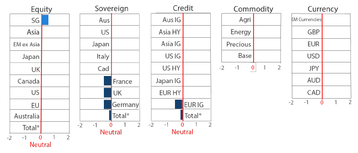
* Total scores for Equity, Sovereign and Credit are weighted average scores, which are computed using market cap weights.
1The asset classes or sectors mentioned herein are a reflection of the portfolio manager’s current view of the investment strategies taken on behalf of the portfolio managed. These comments should not be constituted as an investment research or recommendation advice. Any prediction, projection or forecast on sectors, the economy and/or the market trends is not necessarily indicative of their future state or likely performances.
Research Views
We make adjustments to our asset class views and hierarchies as discussed below.
Global equities
US equities are neutral last month partly on account of a stronger dollar (in November) that is more a headwind for global equities than it is for the US. That said, we do note a possible return to dollar weakness, most recently driven by the Fed’s reiteration of its dovish stance.
Over the last decade, asset allocators that remained overweight US equities versus the rest of world would have done quite well. US equities have gained almost 11% on an annualised basis versus 6.3% for the MSCI All Country World Index. In the midst of a difficult decade adjusting to the “new normal” after the global financial crisis, the US has often been described as the “least dirty shirt” compared to the rest of the world. This has helped support its outperformance.
The least dirty shirt is an apt description, particularly when the dollar is strong and the US is insulated from weak global growth by its relatively closed economy. A strong greenback does not help US earnings when international revenues are converted back to fewer US dollars, but the relative impact is much less than the rest of the world, where weaker demand directly hits the top and bottom line.
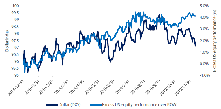
When the Fed turned dovish in late 2018, it seemed the dollar might be poised to stabilise or weaken, allowing global equities to perhaps close some of the performance gap. However, while the pace of dollar appreciation might have softened compared to 2018, US equities once again outperformed the rest of the world on relative dollar strength.
Chart 1: Excess US equity performance over the rest of the world (ROW) vs the Dollar
Source: Bloomberg, 11 December 2019
Despite the Fed’s dovish pivot in late 2018, it kept rates on hold at levels far above its G7 peers, while still reducing its balance sheets (quantitative tightening). This was still far tighter policy than the rest of the world, and it helped to support the dollar. However, now that the Fed has pre-emptively cut rates three times (by 75 basis points in total) since July and has since turned from quantitative tightening by USD 30 billion a month to quantitative easing by USD 60 billion a month, the currency appears to be at an inflection point.
To date, US equities seem relentless in their ability to continue to outpace their global counterparts. But if the dollar continues to weaken on easy Fed policy, improving global demand and much cheaper valuations outside the US, the rest of the world may finally have its day to outperform.
Global bonds
We remain cautious on global government bonds as yields were confined to narrow ranges over the last month. As markets await further news on US-China trade negotiations, and both the Fed and European Central Bank meet in December, we step back and consider the basic fundamentals of bond returns as a measure of value.
Bond returns over one year, for instance, can be parsed into a “carry” return and a “roll” return. Carry is simply the return earned from the yield of a bond and the roll return is determined by the steepness of the yield curve. For example, a 10-year bond yielding 2% will earn 2% for the year plus (minus) a small gain (loss) as the yield rolls down (up) from a 10-year maturity to a 9-year maturity with a normal (inverted) yield curve. As yield curves are normally positive-sloping, investors have traditionally earned positive returns from both carry and roll.
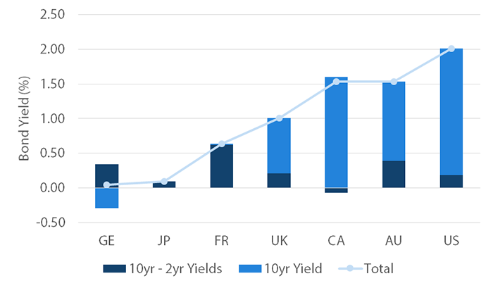
In order to illustrate how developed sovereign bond markets compare in terms of carry and roll currently, we have represented the carry component with 10-year bonds yields and the roll component with the 10-year less 2-year bond yields in Chart 2.
Chart 2: 10-year sovereign bond yields and yield curve spread
Source: Bloomberg, December 2019
The carry component (or yield) is highest in the US, followed by Canada and Australia, while Germany and Japan fare worst with their negative yields. The roll component is most attractive in France and Australia and least attractive in Canada and Japan. When we consider these two components together, Germany and Japan are the least attractive as Germany’s negative yield offsets its relatively steep yield curve and Japan compares poorly on both measures. At the other end of the scale, the normally-shaped yield curves in the US and Australia and relatively higher yields make them the most attractive.
Global credit
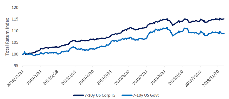
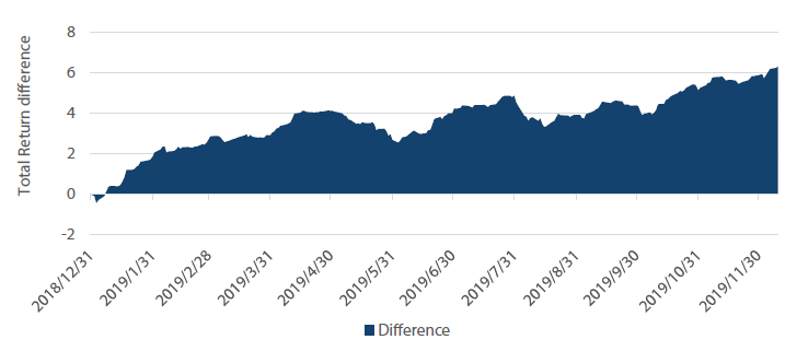
As we approach the year-end, US investment grade (IG) credit has comfortably outperformed US Treasuries. The 7–10 year IG corporate index has returned 16% for the year up to mid-December, outperforming 7–10 year US Treasuries by 7%. Chart 3 and 4 show the running year-to-date relative performance of IG versus Treasuries. IG bonds built up a steady outperformance gap through the year with only a few exceptions. US IG underperformed in May and August following negative turns in US-China trade negotiations with president Trump threatening to impose additional import tariffs on Chinese goods. Both “risk-off” episodes proved to be short-lived and corporate bonds recovered to continue to widen their lead over US Treasuries.
Chart 3: US corporate investment grade (IG) and government bond performance (indexed to 100)
Source: ICE BofAML, Bloomberg, 10 December 2019
Chart 4: Relative performance of US IG versus US Treasuries
Source: ICE BofAML, Bloomberg, 10 December 2019
FX
Markets have braced for (hopefully) the last two major geopolitical events of the year—the UK general election on 12 December and the US’s decision on whether it will impose new tariffs on China on 15 December. The British pound has strengthened considerably on the Tory party’s landslide win in hopes that this will enable the UK to finally initiate an orderly Brexit and avoid a major trade. Meanwhile, the dollar has weakened marginally as new tariffs seem increasingly likely to be postponed.
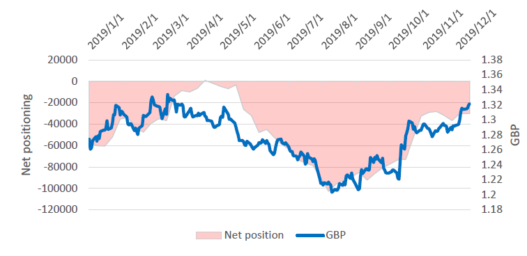
Fundamentally, economic conditions in the UK have been lacklustre and the market is pricing another rate cut in 2020. Notwithstanding the weak economy and an anticipated rate cut, the pound is still relatively cheap, which helped lift the currency on the hopes of a Brexit resolution. Although a reduction of short positioning on the currency has supported its recent performance, it is still broadly under-owned. Continued reversal of short positioning might provide further lift to the currency.
Considering the magnitude of the majority Tory win, it could lead to a sustained bounce in market sentiment and provide support to the currency while negotiations with the EU continue into the new year, making progress towards an orderly Brexit outcome.
Chart 5: GBP, net positioning
Source: Bloomberg, 12 December 2019
Commodities
Amid improvements in the growth backdrop, the outlook for commodities has improved, particularly for energy and industrial metals, which are most leveraged to global demand. On a relative basis, we have favoured energy over metals for its better supply dynamics.
In the December joint-ministerial meeting, OPEC+ surprised markets when it cut supply by a further 500,000 barrels, to a total reduction of 1.7 million barrels a day. Additionally, several countries (mainly Saudi Arabia) will continue their additional voluntary cuts, for a total supply reduction of 2.1 million barrels a day. Saudi Arabia’s voluntary cuts are not selfless though, given the December initial public offering of Saudi Aramco, now the world’s most valuable company.
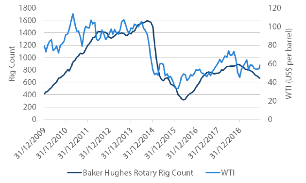
In the US, there are also signs that production growth is set to slow, as evidenced in Chart 6 by the rollover in total rig count back to levels last seen in 2017 following the 2014/15 crash in oil prices. This downward drift in the total rig count since the end of 2018 is somewhat unusual given that the US has typically increased supply on rising oil prices, effectively undermining the efforts by OPEC to reduce supply.
Chart 6: US shale rig count versus WTI
Source: Baker Hughes, Bloomberg, December 2019
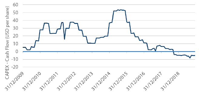
Chart 7 shows that for the first time in 10 years, capital expenditure is below cash flow in exploration and production companies, which paid out more in dividends and share buybacks instead of investing in more production. At least in the medium term, it seems that US production growth is set to remain weak, as reflected in the US Energy Information Administration’s recent downward revision to its projections for 2020 output.
Chart 7: S&P 500 E&P companies CAPEX over cash flow per share
Source: Bloomberg, December 2019
These supply adjustments should support oil prices in the near to medium term. In the months ahead, demand will bear closer monitoring as global growth is expected to improve.
Process
