After extremely strong fixed income returns in 2019, the interest rate outlook for 2020 is far more sanguine as the odds of continued interest rate cuts from the Reserve Bank of Australia (RBA) looks lower than last year. Furthermore when interest rates make moves in the magnitude of last year, they are rarely followed the next year with continued falls but rather enter a period of consolidation.
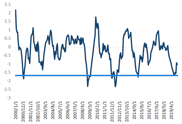
Chart 1 highlights this historical fact by showing the rolling 12-month change in interest rates over the past 20 years. From this perspective, the only times we’ve seen a fall of 1.5% in the Australian 10-year yield were during highly volatile periods: 2000 (tech wreck), 2008 (global financial crisis), 2011 (European Crisis) and 2014 (end of the mining boom). On each occasion, large interest rate rallies in the subsequent years did not ensue.
Chart 1: 12m change in Australian 10-year bonds
Source: Bloomberg, Nikko AM
The bond market moves of last year caught most investors off guard, as many were expecting higher cash rates over the year. Currently, market expectations see the opposite outcome compared to 2019, with forecasts expecting lower cash rates from the RBA and an eventual start of a quantitative easing (QE) program.
While we have some sympathy for why this could be required, we think the case for that occurring in 2020 is nowhere near as clear cut as the market is currently forecasting. In fact, some lead indicators (such as housing and inflation) are beginning to point to 2020 being stronger than 2019, which would allow the RBA to hold some of their monetary policy ammunition in reserve.
Rather than focusing on the current narrative of a slow economy, we pose five big picture questions the RBA should be answering to land at our interest rate outlook.
Rates in 2020 - Benchmarking our expectations
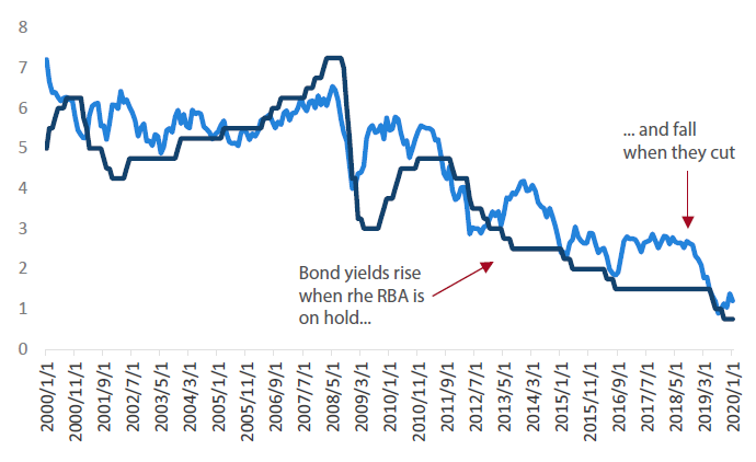
Before looking at those questions we should point out why having a strong cash rate view is so important for making good bond forecasts. The importance stems from the fact that bond yields typically trade at a relatively consistent margin to cash, meaning that if you can get the cash rate call correct, then you should be close to the mark on the bond yield call.
Chart 2: Australian 10-year rate and cash
Source: Bloomberg
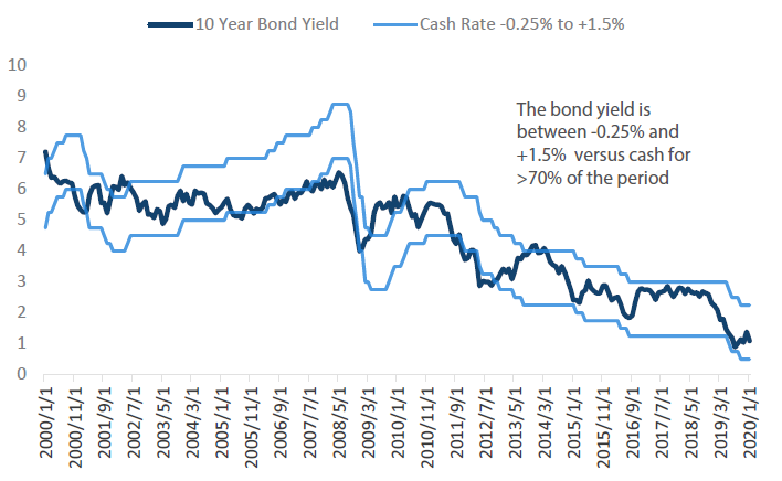
By constructing a range around cash, we can show that over the past 20 years, 10-year bond yields have remained within -0.25% and +1.5% of the cash rate for more than 70 per cent of the period. The only time this range was consistently violated was during the turbulent period between 2008 and 2010. Given we are not expecting a recession in 2020, then our expectations should be for this range to hold.
Chart 3: Cash rate range and 10-year bond yield
Source: Bloomberg, Nikko AM
When forecasting bond yields for 2020, we’re looking to form a view on the following:
- Where do we believe the cash rate will be over the year? This will anchor the range of our yield forecasts.
- Will rates be at the upper or bottom end of that range? This will be a reflection of the market’s view on the direction of the next cash rate change.
As noted above, while the market believes the RBA should be cutting rates, we see a large amount of uncertainty around whether this is true. This reflects the fact that while the current economic data is relatively soft, there are signs that future economic data could improve.
In our view, this makes the cash rate call more variable than the interest rate market is currently letting on. And the above relationship between bond yields and cash rates means that if the economic data comes out stronger than expected, then bond yields may have already set their lows.
With this in mind, we look to determine the outlook of rates this year by posing questions which the RBA will be facing over the near term. Through this exercise we found relatively more positive answers than expected and hence land at a view which could see the RBA move to a neutral cash rate bias in 2020, barring continued flare-ups in geopolitical risk.
Q1 How should the RBA respond to change in the outlook for house prices?
The RBA will need to decide whether the current strength means that they should slow down their policy action or determine that the economy is weak enough to warrant stoking further appreciations.
When the RBA first started cutting interest rates in 2019, the house price outlook was vastly different than today. At the beginning of 2019, house prices had seen 15 consecutive months of declines, were down almost 10% for the year and had the worst returns since the early ’90s. This was beginning to flow into the economy via soft retail sales (particularly in housing-related goods), falling residential building approvals and weak inflation from the housing component of CPI.
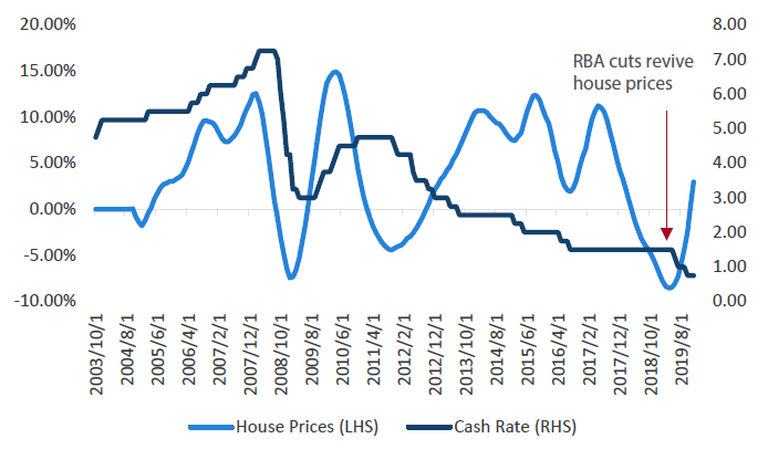
Throughout early 2019, the RBA started to realise that housing was having a larger effect than they had forecast, giving them a strong reason to start contemplating reducing rates. However, since the first cut in 2019 the housing trajectory has turned on a dime. Chart 4 shows the RBA’s actions brought with it an instant upturn in prices.
Chart 4: Australian house prices and cash rate
Source: Bloomberg
This improved housing outlook for 2020, compared to the beginning of 2019, has the potential to create the “gentle turning” point the RBA has spoken of. While the recent housing related data has been sluggish, our indicators show that the economic data can take a few quarters to react. Hence, while the market has been impatient by wanting faster results, we think this may have been asking too much too soon.
To demonstrate this point, we show three key indicators that should show signs of improvement this year and that we believe will be important to watch in early 2020.
I. Household demand
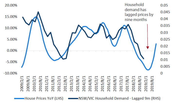
Household demand in New South Wales and Victoria provided a stable base for GDP when it was running at around 3% per annum. However, as house prices fell through 2019, this caused household demand to slow and subsequently lead demand growth to fall to just over 1% p.a. This is a weak outcome given NSW and Victoria are Australia’s two largest states.
However, Chart 5 shows that over the past 10 years household demand in these states has lagged house prices by approximately nine months, meaning house price conditions today will affect demand in 2 – 4 quarter’s time. It also means that it can take some time for the RBA’s actions to flow through to the real economy.
The fact that we have no yet seen a significant pick up in spending does not mean that it will not occur. Rather, we can observe that it’s only now that there has been a positive move in house prices year-on-year, potentially sending a signal to households that now is the time to start spending.
Chart 5: NSW and Victoria household demand and house prices
Source: Bloomberg
II. Housing inflation
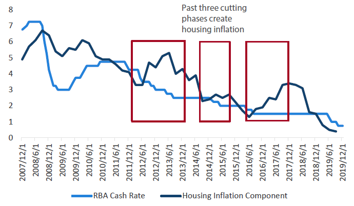
The second factor that can improve is the drag from housing in the inflation basket dissipates. Over the past 10 years, housing inflation has been on a slow trend downwards, falling from ~6% p.a. growth to 20-year-lows of 1% p.a. Despite this downward trend, every time the RBA has cut interest rates housing inflation has risen by 0.5% to 3% over the subsequent 12 months. Given that the response in house prices so far has been similar to previous cuts, we think there is a good argument to be made that housing inflation will also follow the same pattern — providing an improved backdrop from last year.
Chart 6: Housing inflation component and cash rate
Source: Bloomberg
III. Building approvals
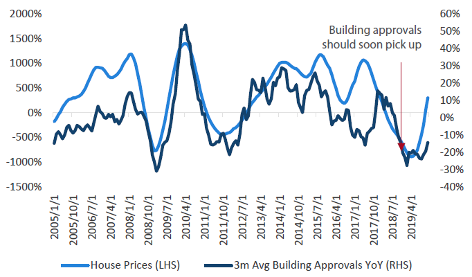
The third improvement that we would expect to see is in the construction outlook for late 2020 — as building approvals typically follow house prices with a lag. Chart 7 shows that building approvals usually decline with house prices and a more positive outlook should give this some support. From a fundamental perspective this makes sense, as a developer will have a greater incentive to build apartments if the price is rising, instead of falling at the fastest pace since 1990 (which we witnessed throughout 2019). In early 2020, we expect this decline in approvals will come to an end and potentially show the first increase since late 2018.
Chart 7: House prices and building approvals
Source: Bloomberg
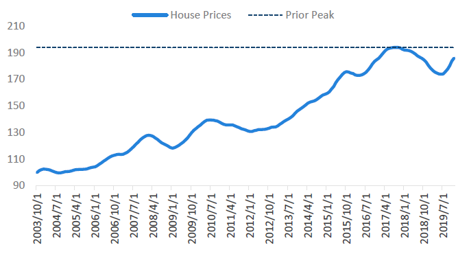
Prices are set to riseWhile not related to economic data, the final point to make on house prices is that the RBA will soon run into more aggressive housing headlines as prices reach all-time highs. Chart 8 shows that the current house price index is only 4% of its 2018 peak. Since prices have been increasing at over 1% per month, we should see prices set new highs in only a few months.
Chart 8: Australian house price index
Source: Bloomberg
In 2018, when prices reached their all-time highs, the median price of property in Sydney was over $1 million and the Australian Prudential Regulatory Authority (APRA) had to implement macro-prudential policies to slow down the market. This created a slew of dramatic headlines that referred to Australian property as being in a bubble and which talked about the financial stability risks it posed. While we don’t want to rehash the arguments around whether these headlines were correct or not, it does raise the question about how far the RBA is willing to push house prices.
KEY TAKEOUT
While none of these indicators say that the improvement in housing-related sectors are a certainty, they do suggest a far stronger outlook than what we saw at the beginning of 2019.
While the market has been impatient with the lack of improvement in the housing data, we believe it is important to understand that monetary policy actions work with a lag. For the RBA, an improvement in the indicators (listed above) over the next 3 – 6 months would create some credence that a “gentle turning” point is indeed underway, which should see more confidence return to the household sector. This would afford the RBA the ability to move to a more neutral rate bias.
At a minimum, we believe the recent increases in housing prices should give the RBA room to pause, waiting a few months to confirm whether the data is improving before throwing more fuel onto the housing market.
Q2 – How strong will inflation and unemployment be in 2020?
While 2019 was not the best year for these two measures, we see signs that the market is being more pessimistic than the data currently indicates.
I. Inflation indicators
The first signs of this improvement can be seen in inflation, as currently the indicators we pay attention to point towards a grind back into the low 2% territory in the first half of 2020. This is based off three key pieces of information, which were not in place this time last year.
Firstly, as noted above, housing inflation should bottom out as the housing market is showing strength. Over the past 10 years, each RBA cut brought with it higher housing inflation.
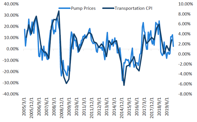
Secondly, Australian petrol prices had started rising and this has a very strong correlation with transportation inflation. If petrol prices remain at their current levels, this would imply transportation prices see mildly positive rises into the first quarter of this year— a small pickup compared to the 0% observed through 2019.
Prior to the outbreak of the coronavirus, oil prices had actually been showing large increases year-on-year, meaning if the market recovers from this shock we could be looking at higher transport-related inflation for the year.
Chart 9: Australian transportation CPI and pump prices
Source: Bloomberg, Nikko AM
Given housing makes up 26% of the inflation basket and transportation 11%, then we are looking at an improved inflation outlook for at least one third of the inflation basket this year. Add to this the effects of the drought in pushing food prices higher, which makes up 18% of the inflation basket, and suddenly there is the potential for higher inflation figures to appear in the middle of this year.
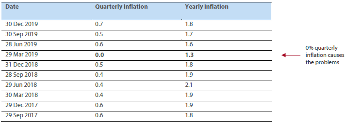
The third reason to expect higher inflation figures is simply from the distribution of inflation outcomes. Table 1 shows the quarterly and yearly inflation figures over the past 24 months. The main reason that headline inflation dipped so low in 2019 was that the first quarter had an inflation print of 0% quarter-on-quarter, taking the consistent 1.8–2.0% inflation level into the low 1% range. Outside of this first quarter, the inflation figures had consistently remained in the 0.4%–0.6% range.
Table 1: Quarterly and yearly inflation figures – 24 months
Source: Bloomberg
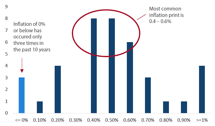
Given we see more inflationary signs in the beginning of 2020 than we did in 2019, we suspect that in 1Q 2020 this zero outcome will be replaced with a higher quarterly figure, pulling inflation back towards 2% instead of 1%. From a distribution perspective, this makes sense. Chart 10 buckets the quarterly inflation outcomes of the past 10 years by their frequency. During this period only three quarters have seen a quarterly inflation print of 0% or lower. The bulk of the distribution has been between 0.4% and 0.6%.
Chart 10: Australia – quarterly inflation distribution
Source: Bloomberg, Nikko AM
The above data points to an inflation outlook which is improving rather than deteriorating, and the fact that this 0% inflation figure will eventually roll out of the year-on-year figures should cause inflation to look better than this time last year. While we are not forecasting inflation running above the RBA’s target, there is at least some evidence that the RBA will be closer to achieving their 2–3% inflation mandate in 2020 than they were in 2019.
II. Unemployment outlook
The next point for the RBA to consider is the unemployment outlook. While the market has been relatively negative on the employment conditions, we see no evidence that the situation has changed dramatically for the worse. In fact, looking at the employment figures of 2019 shows that the narrative on unemployment may far outweigh the facts.
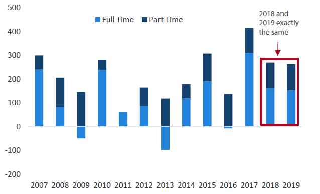
This can be seen in Chart 11 where we compare the employment outcomes of 2018 (a year when the market was talking about hikes) with the outcomes of 2019 (a year when the RBA cut). In both years, the Australian economy produced approximately 260,000 jobs, with a very similar split between full-time and part-time work. What we found surprising was that despite all the negative talk around employment in 2019, there was only one month (October) when the employment change was negative.
Chart 11: Total employment by year
Source: Bloomberg, Nikko AM
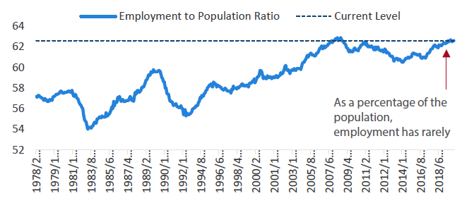
While the unemployment rate shifted slightly higher during the year, ending 2019 at 5.1%, this was only marginally higher than the 5.0% seen at the end of 2018. Additionally, the outright levels of employment are only marginally below the high point seen in 2007, as the employment to population ratio (an employment indicator which calculates what percentage of the population is working) saw an almost record high of 62.6% of the total population working.
Chart 12: Australia – employment to population
Source: Bloomberg
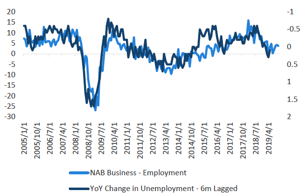
It’s important to separate the narrative around employment from the facts. Yes, some forward looking indicators have started to slow (such as job advertisements and vacancies), but the NAB employment conditions have stabilised and the RBA has started providing support to the economy. We find the NAB business conditions is one of the better indicators at forecasting the unemployment rate in the near term, and this is suggesting that the unemployment rate should move sideways, i.e. ~5.0–5.2%, over the coming months.
Chart 13: NAB employment conditions and unemployment rate change
Source: Bloomberg
This would suggest that not only was the narrative around employment misguided in 2019, but the near-term forecast should not be as bearish as the market currently insists.
KEY TAKEOUT
With a forecast of inflation rising back to 2% and the unemployment rate stabilising, we find it hard to understand just why the RBA would want to be any more aggressive on the cash rate than it has in the past. Simply speaking, the RBA’s goal is to achieve full employment and stable prices, both of which are arguably close to being realised.
Expecting the RBA to deliver five interest rate cuts (three they have already done plus the two the market wants) as well as starting QE seems as a bridge too far unless these conditions change.
Q3 – Is global trade set to improve?
2019 proved to be a relatively weak year for global trade and, unsurprisingly, the Chinese trade statistics reflected this reality. However, there are some tentative signs that this could be slightly more positive for 2020.
I. Chinese trade statistics
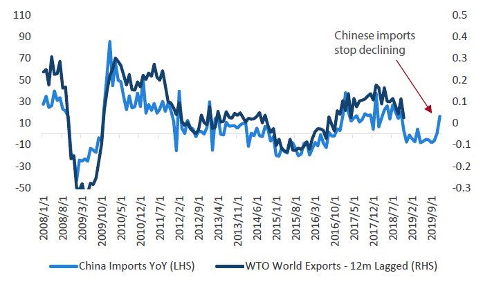
The first positive sign for global trade is that Chinese trade statistics have shown signs of life after being consistently weak for the past 12 months. Importantly for global trade, Chinese imports lead the global cycle by approximately 12 months and in the back end of 2019, saw a relatively large rise. This means that as long as the coronavirus does not considerably alter the momentum of the global economy, then come mid-2020 we should see signs that global trade is beginning to improve and potentially pick up dramatically in the back end of 2020.
Chart 14: World trade and Chinese imports
Source: Bloomberg, World Trade Organization
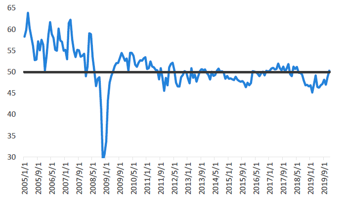
Reflecting this positive import outcome, the Chinese PMI figures saw new export orders rise above 50 the first time since the middle of 2018. This is off the back of positive outcomes between China and the US on trade talks, potentially signalling that companies are becoming more positive on the future trade environment.
Chart 15: China PMI figures – New export orders
Source: Bloomberg
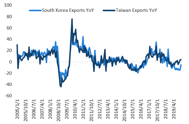
Additionally, South Korean and Taiwanese exports—two economies which are traditionally thought of as the canary in the coal mine of global trade—started improving. Both countries had negative outcomes through 2019, which have started turning and could signal that the pickup is more widespread than simply China.
Chart 16: Asian exports
Source: Bloomberg
The caveat to this improvement is that these statistics have been occurring through the December and January data. Whether this improvement can continue in the face of the coronavirus is yet to be a seen and poses a large risk to global trade. This is addressed in a separate question below.
II. A change in sentiment
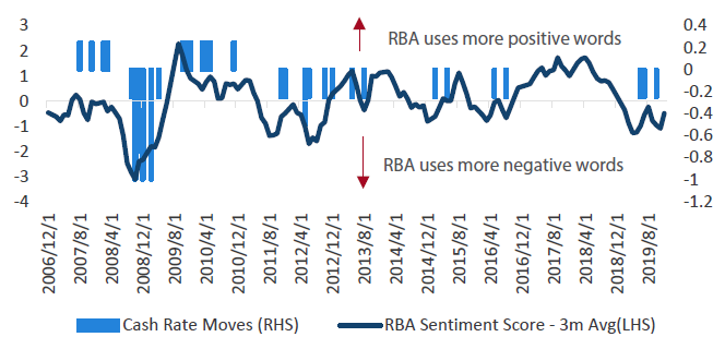
These more positive outcomes, combined with some signs of a potential trade deal, could shift how the global economy views the current trade situation. In fact, we could begin to see this reflected in improved sentiment from the RBA, which we first started to see deteriorate in early 2019 as the trade situation soured.
An example of this can be seen in our RBA sentiment indicator, a model that calculates how many positive and negative words the RBA uses throughout their minutes. The higher the indicator moves, the more positive words (and hence more hawkish the RBA becomes). The lower the indicator goes the more negative language (and hence dovish) in the statement.
This shows that the more negative words the RBA uses, the more likely it becomes that they are just about to ease rates, as their sentiment typically drops into negative territory about six months before they cut.
Chart 17: RBA sentiment score
Source: Bloomberg, Nikko AM, Reserve Bank of Australia
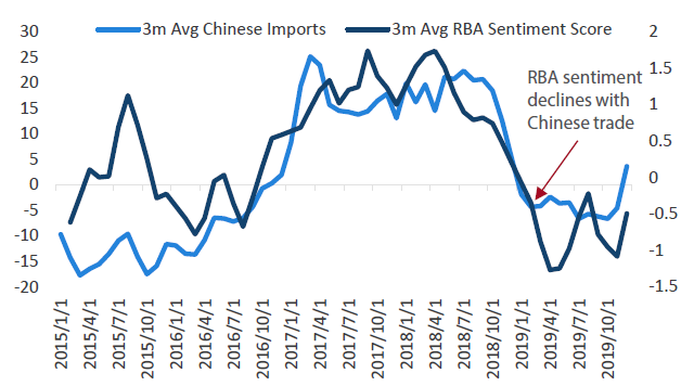
Interestingly, the increase in negative word use in 2019 (i.e. the indicator falls) came just after the trade situation deteriorated in China. As Chinese imports fell through late 2018 and into early 2019, the RBA introduced more negative words into their statements to reflect the fact that the global environment was no longer a positive factor for the Australian economy.
Chart 18: RBA sentiment and Chinese imports
Source: Bloomberg, Nikko AM, Reserve Bank of Australia
Let’s take a look at an example. In September 2019, shortly after the US increased tariffs on China, the RBA had the following to say about global trade conditions:
More generally, global trade volumes had fallen over the previous year, reflecting both the escalation of trade tensions and slower growth in Chinese domestic demand. Weak external demand had been reflected in slowing growth in global industrial production and below-average conditions in the global manufacturing sector. Recent indicators suggested trade-related activity would remain weak for some time.
— Source: RBA Minutes, September 2019
If there is any improvement in the global trade conditions then it stands to reason that the concern that the RBA had for downside risks in the global economy can be reduced. Given the RBA referred to both trade tensions and weak China demand, both aspects could be in for some respite in early 2020, which will give the RBA a reason to be, at a bare minimum, less negative than they were at the end of last year.
III. The unknown
Lastly, while the recent outbreak of coronavirus has shut down major Chinese cities over Chinese New Year, we will need to wait to see how this has affected demand for their products. This outbreak is discussed further below as it is slowly morphing into a larger risk for markets.
KEY TAKEOUT
While it is incredibly difficult to reliably forecast international trade levels, some of the lead indicators are beginning to look positive. Rising Chinese imports, increasing new export orders and exports increasing in key Asian economies point to an international trade environment that is stronger than 2019.
If this is true, the Australian economy should benefit from the improved environment which will give the RBA less urgency to move rates. Perhaps this will be an over-optimistic forecast in the face of the outbreak of the coronavirus in China, but it seems the RBA should have at least tepid optimism compared to September 2019 when the Chinese trade war was accelerating.
Q4 –Where is the Tail Risk – The known unknowns?
The past two years have shown that geopolitical risks seem to be coming faster and more common than previously seen, meaning the RBA will need to determine if there is tail risk for the economy outside the traditional economic metrics.
While we cannot forecast the unknowns of the geopolitical environment, there is enough known geopolitical risk sitting on the horizon that it could lead the RBA to be more dovish than would otherwise be the case.
For example, over the past six months we have seen the US–China trade war ebb and flow between deal or no deal; a contagious flu shut down multiple cities in China, and the US and Iran provoking each other towards a war. The risk from each of these events could trigger the RBA to ease rates in order to provide comfort to the market. Given these events can be hard to forecast, the most likely response from the RBA is to remain cautious as they persist and to be ready to act if required.
I. A risk that’s spreading
While we don’t cover the US–China trade war (as enough ink has already been spilled on this topic) or the deterioration in relationship between Iran and the US in this outlook, it is worthwhile pointing out the risk that could come from the coronavirus, which appears to have originated in China.
At the time of writing, the facts surrounding this disease are murky as the number of cases and deaths rise by the day. However, from the information available the market is so far looking at it in a similar nature as the SARS outbreak of 2003, although it seems to be less deadly (i.e. a lower mortality rate) but more contagious.
It is hard to determine just how many people will contract the disease and how long the epidemic will last, so we’re unable to forecast just how large the effect will be on international conditions. More specifically though, the fact that the Chinese government has quarantined multiple cities, with a combined population in the tens of millions of people, it means there will likely be a hit to Chinese GDP as, among the numerous other effects, consumption will be lower and tourism down. Additionally, the timing of the event over Chinese New Year means the effects will be larger than if this had of occurred at a different time of the year.
From this perspective, the total effect is currently unknown, but we do know that it will not be positive. The offset to this is that the Chinese government could (and likely will) introduce easier fiscal policy to offset the weaker conditions that their containment policies have created. Depending on the actions that they take, this could potentially see a slowdown in GDP for the first half of the year, which is followed by an acceleration in the second half.
II. Chinese demand and tourism
Whether these risks are enough to cause the RBA to cut or not are a key question that they will need to answer this year. Slower Chinese demand and weaker travel from Chinese tourists, which represent the greatest number of outbound tourists in the world, would be a key risk for the Australian economy, coming at a time when GDP is weak. While we think that the RBA should not overact to this information, and wait to see how global trade evolves over the next three months, it does create a story that naturally feeds into easier rates and will cause the RBA to become more dovish if it persists for some time.
KEY TAKEOUT
On the geopolitical side, new risks seem to be hitting the headlines every week. This is likely weighing on global growth and potentially hurting optimism in the economy. As such, the RBA will want to monitor the risks closely and potentially cut interest rates if they believe they are adversely impacting the economy.
Additionally, as long as these risks are hanging over the economy, it will mean that the RBA has a strong reason to be concerned and will have a good reason to become more dovish if required. While we do not yet see these risks as requiring easier rates, the increase and frequency of geopolitical risks means it can be hard to feel completely comfortable in a neutral cash rate view.
Q5 – How will the RBA respond to the widespread bushfires?
The short-term effect is that GDP will be slower, but this usually rebounds in the medium term when investment in the impacted areas resumes.
The recent bushfires that have hit Australia have been some of the worst in history, burning a total land size of more than 8 million hectares (and counting), which is comparable to all of Scotland. The persistent fires caused severe air pollution and smoke to cover some of the major cities for weeks on end, likely slowing tourism and retail sales over the period. This should mean GDP will be slower in the back end of 2019, as weaker consumption and the widespread destruction across the affected areas will hurt growth.
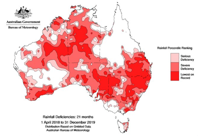
On top of this, Australia has also recorded the highest temperatures on record and the Australian Bureau of Meteorology stated that December rainfalls had been the lowest on record for a 3-year period “when averaged over the Murray-Darling basin and New South Wales” (January 2020). This is unwelcomed news for farmers who have been operating in some of the worst drought conditions in the past 100 years.
Figure 1: Australian rainfall deficiencies over 21 months
Source: Australian Bureau of Meteorology
http://www.bom.gov.au/
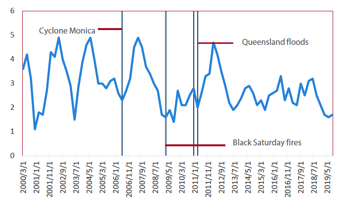
While the total financial cost from the fires is unknown at the time of writing, most estimates have put the effect on GDP in the short term at a drag of around 0.2% – 0.5%. While this is by no means enough to cause a recession, it has come at a time when GDP is at its weakest in 10 years. If the RBA was negative enough on the conditions, it could be seen as just one more reason to move rates. However, while there is a short-term impact, If past natural disasters are anything to go by we should see this be a positive for GDP in the next few quarters as higher investment will occur across the regions that have been hit by the bushfires (refer to Chart 19).
On top of this we see a fiscal response to the affected regions as the more appropriate policy measure as it means the help required will land where it is needed most, rather than lower rates benefitting the country at large. As such, we think that the RBA should not react to the fires, as the medium term effects will be limited and it is more appropriate for a fiscal (rather than monetary) policy response.
Chart 19: Australian GDP
Source: Bloomberg
The other consideration here is whether the RBA should be responding to these events and what that would say about the future for potential policy action. The 2018 State of the Climate report released by the Bureau of Meteorology (BOM), made the following comments about the future of Australian weather:
“Australia’s national climate projections… indicate that over coming decades Australia will experience:
- Further increase in temperatures, with more extremely hot days and fewer extremely cool days...
- A decrease in cool-season rainfall across many regions of southern Australia, with more time spent in drought…
- An increase in the number of high fire weather danger days and a longer fire season for southern and eastern Australia”
More hot days, lower rainfall, more drought and an increase in the number of high fire weather. This is exactly what occurred over the past two years and means that we should be thinking about these events from a longer-term perspective.
If the RBA simply cuts interest rates every time a national disaster occurs, it has the potential to shirk the responsibilities of the government in addressing the effects of the rising temperatures and will potentially go around democratic process if voters demand environmental action. While it remains up to the RBA as to how they react to this outcome, the future forecasts for Australia’s weather could mean that cutting in the face of a natural disaster potentially sets them up for additionally easier policy in the future — a slippery slope if these conditions occur more frequently.
KEY TAKEOUT
We think the RBA should look through the effect of the recent fires. While GDP will likely be slower in the short term, it should not affect the medium-term outlook. Additionally, we think that it would be more appropriate for a fiscal response to natural disaster, as BOM’s forecast for hotter weather in the future could mean these types of events become more frequent, and we do not believe it should be the RBA’s responsibility to form policy on that basis.
Putting it together
Overall, we believe there is a higher probability that the RBA will be able to remain on hold this year, rather than cut rates. Yes, there are still near-term risks and the economic data is currently soft, but the employment indicators have been strong, inflation is more likely to be higher in 2020 than 2019, the Chinese trade situation has shown signs of improving, and the housing outlook is positive.
While we can see why the market is forecasting additional rate cuts, it is beginning to look like they are pricing in far more action from the RBA than will be warranted in 2020,and there are improving odds that the RBA will end up on hold.
Using this information we can return back to our bond forecasts for 2020 and re-examine the original points with which we will anchor our expectations:
- Where do we believe the cash rate will be?
- Will rates be at the upper or bottom end of that range?
With this outlook we can construct the following two ranges of what we currently see as the likely outcomes for interest rates in 2020.
I. The RBA remains on hold
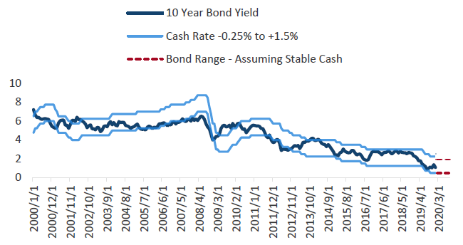
In this environment, the cash rate remains at 0.75% and we would expect to be in the upper half of the -0.25% to +1.5% range. This would see our expectations for 10-year bond yields in 2020 at around 1.50% – 1.60%; about 50 basis points above where they are currently trading.
Chart 20: Cash rate range and 10-year bond yield
Source: Bloomberg, Nikko AM
II. The RBA cuts rates
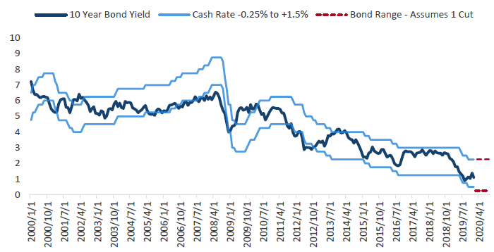
In the event that the above analysis was too optimistic, we can also create a bond range based on RBA action. Given we see some upside for the economic data, and the RBA is getting close to zero, Chart 21 shows the bond range for one cut (taking the cash rate to 0.50%) in 2020. In this environment, bonds likely remain in the bottom half of the range created, as the market will continue to expect further action from the RBA. This would likely put 10-year yields in the 0.80% to 1.00% range, approximately 10 to 20 basis points lower than where they are today.
Chart 21: Cash rate range and 10-year bond yield
Source: Bloomberg, Nikko AM
In light of these forecasts there are a few important points worth pointing out:
Firstly, unless the economic situation deteriorates rapidly, it is hard to foresee how bonds can match the rallies that occurred through 2019. We are loath to suggest that it can’t happen, but rather the cash rate would have to continue to fall dramatically to make it a likely outcome. Barring a global recession or the coronavirus having a far worse effect on Chinese GDP than currently expected, we cannot yet see the data which would really support this view.
Secondly, using the ranges we have constructed shows that if the RBA is indeed close to their terminal cash rate (whether it is one cut or on hold), bond yields at their current levels are not far away from the bottom of their range. Any bond rally through 1.0% will likely need to be backed up by poor domestic or international data to sustain yields at those levels, otherwise rates should slowly drift higher.
Thirdly, while our view is likely more optimistic than the market, we do not think there is a realistic chance that the RBA would be hiking rates in 2020. So, while our base case view is for bonds to move higher, this will likely see very strong resistance should they move towards 2%. Thus, while this is not an especially helpful comment for those who like point forecasts, it does mean our view is that yields will most likely remain between 1–2% for 2020.
Important Information
This material was prepared and is issued by Nikko AM Limited ABN 99 003 376 252 AFSL No: 237563 (Nikko AM Australia). Nikko AM Australia is part of the Nikko AM Group. The information contained in this material is of a general nature only and does not constitute personal advice, nor does it constitute an offer of any financial product. It is for the use of researchers, licensed financial advisers and their authorised representatives, and does not take into account the objectives, financial situation or needs of any individual. The information in this material has been prepared from what is considered to be reliable information, but the accuracy and integrity of the information is not guaranteed. Figures, charts, opinions and other data, including statistics, in this material are current as at the date of publication, unless stated otherwise. The graphs and figures contained in this material include either past or backdated data, and make no promise of future investment returns. Past performance is not an indicator of future performance. Any economic or market forecasts are not guaranteed. Any references to particular securities or sectors are for illustrative purposes only and are as at the date of publication of this material. This is not a recommendation in relation to any named securities or sectors and no warranty or guarantee is provided.


